
How about this then! Here's little old me, with very limited knowledge of PSP and I'm doing a tutorial on it *LOL*
 I've no idea if this is the right way of doing it but it's what I've found by playing and with snippets of info I've picked up/retained from others (mentioned in earlier posts). I'm sure there must be an easier - and quicker - way but this works for me so hope it does for every one else. The tutorial will take you through how to make the example on the right (hopefully) but goes one step further in that it also tells you how to add transparency to it so that it really does become a 'watermark'. I left the transparency off of this example to show the effect of layering text, in more detail. I would also say that the text is much larger than I would do in relation to the size of the picture but this is deliberate for the purposes of the tutorial.
 I've no idea if this is the right way of doing it but it's what I've found by playing and with snippets of info I've picked up/retained from others (mentioned in earlier posts). I'm sure there must be an easier - and quicker - way but this works for me so hope it does for every one else. The tutorial will take you through how to make the example on the right (hopefully) but goes one step further in that it also tells you how to add transparency to it so that it really does become a 'watermark'. I left the transparency off of this example to show the effect of layering text, in more detail. I would also say that the text is much larger than I would do in relation to the size of the picture but this is deliberate for the purposes of the tutorial.
TUTORIAL - PEEJAY’S VERSION OF CREATING A WATERMARK IN PSP9
Click on any image for a larger view
I do my name with an enlarged initial letter and smaller lower case ones and I also stagger the words so I’ll take you through the procedure that I do. If you want your text to be the same size then you can do it in one text box in one go, or 2 or more if you want to stagger the words …
1. Open a new, transparent sheet. I use a large one because you can crop when finished so I think it's better to start big and crop, than not big enough and have to start over if you run out of room! I usually have a 7x5 inch landscape to start with.

2. Select the Text tool and click on the sheet. From the text toolbar I have ‘Create as’ on Floating and stroke width at 0.0. Everything else was just as it opened up for me – I didn’t change anything (hope tool bar is clear in piccie – zoom view if not).

3. Select the colour for your text from the Materials toolbar. I eventually chose white but I didn’t while playing becaeus I found it difficult to see what I was doing so I played with a colour until I was happy with the method and ready to try one for real.

4. In Text box type the first letter – P in my case – highlight it and choose the font you want from the font box. Keep it highlighted and choose the size. The size you choose for the initial letter really depends on the font you choose as some need a larger size than others so it’s trial and error. Check the ‘Remember text’ box – just in case you decide you don’t like what you’ve just done when you see it properly. It makes it easier to get it back, although you don’t have to do it. Click ‘Apply’ There should now be a dotted line around the letter. This will allow you to move it around but first –

5. Go to Effects, 3D Effects, and Drop Shadow. Play with the shadow effect there until you’re happy with it (make sure that ‘shadow on new layer’ is not checked) and click OK. Now position this letter on the sheet.

6. Click on the sheet again and click OK if you get a box come up that says the selection must be defloated. Now highlight the letter in the text box if you checked ‘Remember Text’ and overtype in the rest of your name – ‘am’ in my case.

7. Highlight the new text, select your font (I keep the same at this stage), select the size (I usually choose a smaller number than I used for the initial letter but that is your choice), and again make sure that you’ve checked the ‘Remember Text’ box if you want to and click ‘Apply’. Follow the procedure in point 5.

8. Continue in same way for your Surname if using but if not you can continue adding any text and positioning it until you’re happy with it. If you want to layer any lettering you have to do it before you ‘defloat’ and you do it by right clicking on the highlighted ‘Floating Selection’ in the Layers toolbox, going to ‘Arrange’ and selecting ‘Send to Bottom’ or ‘Bring to Top’
.jpg)
9. You can add a copyright logo © by copying and pasting one from Word. I’ve not found a way of typing one in the text box. Doesn’t seem to like it but it will allow you to paste it in. Treat it in exactly the same way or leave the drop shadow off. Choice is yours, as ever.
***Update: To type a © in the text box press Alt and type 0169 from the numeric keypad on the right of your main keyboard. If you don't have one it won't work and you need to copy/paste as mentioned. Neither does it work for all fonts as some don't recognise the symbol.
10. Now, if you want to add an image you need one that is a .png image. I’ve made my own by finding an image, removing the background and saving it to my PC. Open the image in PSP, Edit and Copy then ‘Paste as New Selection’ onto the sheet that has your text on. Now you can move it around to position it to where you want it and ‘Send to Bottom’ or ‘Bring to Top’ if you want to, as per instruction #8. Basically play until you’re happy with the positioning!
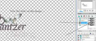
11. At this stage you can fade the picture a little if you want to, especially if the text is laying over it so that the text is more prominent. You need to right click on highlighted Floating Selection in the Layers toolbox and select Promote Selection to a Layer.
.jpg)
12. You will note that in the Layers toolbox there are 2 columns. You’re now looking at the right hand column which has a slider bar on it. This will fade the image (make it more transparent). If I’m fading to bring the text more to the fore I’ve been doing it to around 80%.
13. That is basically your watermark done. You now have to bring it all together as an image so you need to click on the Layers drop down, select Merge and click on Merge Visible. You will note that there is now just one layer in the Layers toolbox which says ‘Merged’.
.jpg)
14. At this point crop the watermark as close as possible.

15. I usually save it now, before I start adding transparency but you don’t have to if you don’t want to …. You’re saving as a Tube.
16. To save your creation as a Tube click on File, Export, Picture Tube and give it a name in the box that comes up. Click OK. That’s your original watermark saved.

17. You can fade the watermark (add transparency) by following instruction #12 (remember that there is now only one layer to work from). I usually do 2 – one to 75% (top) and one to 50% (bottom), saving each as individual tubes. It then gives me a choice as to what I use on what piccies and also gives you a choice as to how prominent you want your watermark to be on your picturess.

 USING THE TUBES TO ADD AS WATERMARKS
I always resize my photos for my blog or posting anywhere else to around 650 pixels on the largest side. You will find that the full size of watermark is probably too big but again, it’s trial and error to what you like. To use it in the first place …
A. Open an image you want to use and resize.
B. Find the Picture Tube Tool on the left hand menu and click on it. A new toolbar will open at top of picture window

C. Click on the drop down and find your watermark, select it. Your cursor will look like a funny stamp thing and all you do is click on your photo roughly in the area you want your watermark. If you don’t like it ‘undo’ and try again. It’s a play thing!

D. It’s very likely that the watermark is going to be far too big but you can adjust the size of it by changing the ‘Scale’. Depending on how big your original watermark is you may need to take it down to 20 or less – again, it’s playtime!

I've put 3 watermarks on the image above (well, 4 really but the very bottom one isn't part of this tutorial *lol*). A is the full watermark, saved first. B is at 75% transparency and C is 50% transparency. You should also note that these watermarks are only 20% of their original size so the base one is really big! You may want to dramatically reduce the size of the original but I wanted to do it big for the tutorial. I prefer to have a large base one available (although not this big *LOL*) in case I want to watermark a large photo and just reduce the size for resized photo's.
Well, think that’s about it, in as much detail as I can do and hope I haven’t missed anything. Any questions then please ask in the comments and I will answer as best I can, if I can. There are a lot of stages to producing this watermark (less if you keep same sized font and don't stagger text) and I’m sure there must be easier ways of doing it but it’s what I’ve come up with, with my limited PSP9 knowledge. It isn't difficult though, once you get the hang of it and, as with most things, the more you do the quicker it becomes. Whether this tutorial will work for other versions I have no idea …
Enjoy!!

UPDATE: These instructions have been used successfully, I'm informed, in PSP12 so guess the basis is the same for all versions, once you find the tools!
1. Open a new, transparent sheet. I use a large one because you can crop when finished so I think it's better to start big and crop, than not big enough and have to start over if you run out of room! I usually have a 7x5 inch landscape to start with.

2. Select the Text tool and click on the sheet. From the text toolbar I have ‘Create as’ on Floating and stroke width at 0.0. Everything else was just as it opened up for me – I didn’t change anything (hope tool bar is clear in piccie – zoom view if not).

3. Select the colour for your text from the Materials toolbar. I eventually chose white but I didn’t while playing becaeus I found it difficult to see what I was doing so I played with a colour until I was happy with the method and ready to try one for real.

4. In Text box type the first letter – P in my case – highlight it and choose the font you want from the font box. Keep it highlighted and choose the size. The size you choose for the initial letter really depends on the font you choose as some need a larger size than others so it’s trial and error. Check the ‘Remember text’ box – just in case you decide you don’t like what you’ve just done when you see it properly. It makes it easier to get it back, although you don’t have to do it. Click ‘Apply’ There should now be a dotted line around the letter. This will allow you to move it around but first –

5. Go to Effects, 3D Effects, and Drop Shadow. Play with the shadow effect there until you’re happy with it (make sure that ‘shadow on new layer’ is not checked) and click OK. Now position this letter on the sheet.

6. Click on the sheet again and click OK if you get a box come up that says the selection must be defloated. Now highlight the letter in the text box if you checked ‘Remember Text’ and overtype in the rest of your name – ‘am’ in my case.

7. Highlight the new text, select your font (I keep the same at this stage), select the size (I usually choose a smaller number than I used for the initial letter but that is your choice), and again make sure that you’ve checked the ‘Remember Text’ box if you want to and click ‘Apply’. Follow the procedure in point 5.

8. Continue in same way for your Surname if using but if not you can continue adding any text and positioning it until you’re happy with it. If you want to layer any lettering you have to do it before you ‘defloat’ and you do it by right clicking on the highlighted ‘Floating Selection’ in the Layers toolbox, going to ‘Arrange’ and selecting ‘Send to Bottom’ or ‘Bring to Top’
.jpg)
9. You can add a copyright logo © by copying and pasting one from Word. I’ve not found a way of typing one in the text box. Doesn’t seem to like it but it will allow you to paste it in. Treat it in exactly the same way or leave the drop shadow off. Choice is yours, as ever.
***Update: To type a © in the text box press Alt and type 0169 from the numeric keypad on the right of your main keyboard. If you don't have one it won't work and you need to copy/paste as mentioned. Neither does it work for all fonts as some don't recognise the symbol.
10. Now, if you want to add an image you need one that is a .png image. I’ve made my own by finding an image, removing the background and saving it to my PC. Open the image in PSP, Edit and Copy then ‘Paste as New Selection’ onto the sheet that has your text on. Now you can move it around to position it to where you want it and ‘Send to Bottom’ or ‘Bring to Top’ if you want to, as per instruction #8. Basically play until you’re happy with the positioning!
11. At this stage you can fade the picture a little if you want to, especially if the text is laying over it so that the text is more prominent. You need to right click on highlighted Floating Selection in the Layers toolbox and select Promote Selection to a Layer.
.jpg)
12. You will note that in the Layers toolbox there are 2 columns. You’re now looking at the right hand column which has a slider bar on it. This will fade the image (make it more transparent). If I’m fading to bring the text more to the fore I’ve been doing it to around 80%.

13. That is basically your watermark done. You now have to bring it all together as an image so you need to click on the Layers drop down, select Merge and click on Merge Visible. You will note that there is now just one layer in the Layers toolbox which says ‘Merged’.
.jpg)
14. At this point crop the watermark as close as possible.

15. I usually save it now, before I start adding transparency but you don’t have to if you don’t want to …. You’re saving as a Tube.
16. To save your creation as a Tube click on File, Export, Picture Tube and give it a name in the box that comes up. Click OK. That’s your original watermark saved.

17. You can fade the watermark (add transparency) by following instruction #12 (remember that there is now only one layer to work from). I usually do 2 – one to 75% (top) and one to 50% (bottom), saving each as individual tubes. It then gives me a choice as to what I use on what piccies and also gives you a choice as to how prominent you want your watermark to be on your picturess.


I always resize my photos for my blog or posting anywhere else to around 650 pixels on the largest side. You will find that the full size of watermark is probably too big but again, it’s trial and error to what you like. To use it in the first place …
A. Open an image you want to use and resize.
B. Find the Picture Tube Tool on the left hand menu and click on it. A new toolbar will open at top of picture window

C. Click on the drop down and find your watermark, select it. Your cursor will look like a funny stamp thing and all you do is click on your photo roughly in the area you want your watermark. If you don’t like it ‘undo’ and try again. It’s a play thing!

D. It’s very likely that the watermark is going to be far too big but you can adjust the size of it by changing the ‘Scale’. Depending on how big your original watermark is you may need to take it down to 20 or less – again, it’s playtime!

I've put 3 watermarks on the image above (well, 4 really but the very bottom one isn't part of this tutorial *lol*). A is the full watermark, saved first. B is at 75% transparency and C is 50% transparency. You should also note that these watermarks are only 20% of their original size so the base one is really big! You may want to dramatically reduce the size of the original but I wanted to do it big for the tutorial. I prefer to have a large base one available (although not this big *LOL*) in case I want to watermark a large photo and just reduce the size for resized photo's.
Well, think that’s about it, in as much detail as I can do and hope I haven’t missed anything. Any questions then please ask in the comments and I will answer as best I can, if I can. There are a lot of stages to producing this watermark (less if you keep same sized font and don't stagger text) and I’m sure there must be easier ways of doing it but it’s what I’ve come up with, with my limited PSP9 knowledge. It isn't difficult though, once you get the hang of it and, as with most things, the more you do the quicker it becomes. Whether this tutorial will work for other versions I have no idea …
Enjoy!!
UPDATE: These instructions have been used successfully, I'm informed, in PSP12 so guess the basis is the same for all versions, once you find the tools!
2 comments:
Well it worked perfectly for me Pam..... thanks loads for taking the time to make this into a tutorial for all to share.
Brilliant!!
Sam
xx
hi pam
i have saved your tut so i can have a go later on... sam shared it with me..
thanks 4 taken the time to do this tut
kaz_za
Post a Comment